UXperiment. An App about Experience
This project has been developed for the Share Knoeledge event hosted at the Apple Developer Academy
?? ROLE
Designer, Developer, Presenter
? TEAM
I was fully in charge of the design and development of the entire project
 WHEN
WHEN
April 2018 - 5 Days
? SKILLS
Figma, Xcode, Pitch Presentation
─ OVERVIEW
Share Knowledge Event
UXperiment is a project developed for experimental purposes during my learning path at the Apple Developer Academy. The spirit of the academy is to learn from others as much as you can, because the knowledge is in everything around us. In fact, students were often encouraged to share their interests and skills in order to contribute to the learning growth of the others
For this reason in the middle of our 9 months learning experience, we hosted an event called Share Knowledge: during an entire week, students were invited to have public talks for sharing their skills, tips and “hows to” with others. Didn’t matter what you were good at, the only thing that matters was to add value to the shared knowledge
My design mentor encouraged me to participate at the event and to host a talk about design. I was really excited at the idea and I was really committed to do my best
─ THE PROCESS
Ideation
Since I am very passionate about UX I decided to focus my entire talk on this topic. But, I had to take into consideration that the majority of student at the Academy were developers who often underestimate the importance of a good UX. Furthermore, since they get bored very easily when people don’t talk about nerdy things they like, I put aside the idea of holding a standard talk about UX. I needed a creative and crazy idea which could raise their interest and, since I had just one week to prepare all the materials, I needed it fast. The idea came unexpectedly: since I was one of the few designers at the academy, a lot of friends and students come to me for testing their apps or ask for advice. While I was testing one of those apps, I suddenly thought:
Why don’t build an app completely unusable with all the common UX mistakes made by students?
This was exactly the idea I was looking for: informative, creative and crazy enough to catch other’s attention. Furthermore, learning while doing and (why not, while having fun!) is one of the best learning experience possibile
How it works
So, as first thing I tried again all the apps people ask me to, and I started writing down all the mistakes I noticed. I had very short time: just 5 days to ideate, code and distribute the app before the talk, so I decided to keep it short and I tried to categorize all the mistakes I was finding in categories. After 1 full day of apps testing, I had these main categories of common mistakes:
- Lack of information
- Lack of consistency
- User habits not taken into consideration
- Lack of visual hierarchy
- Impossibility to skip processes
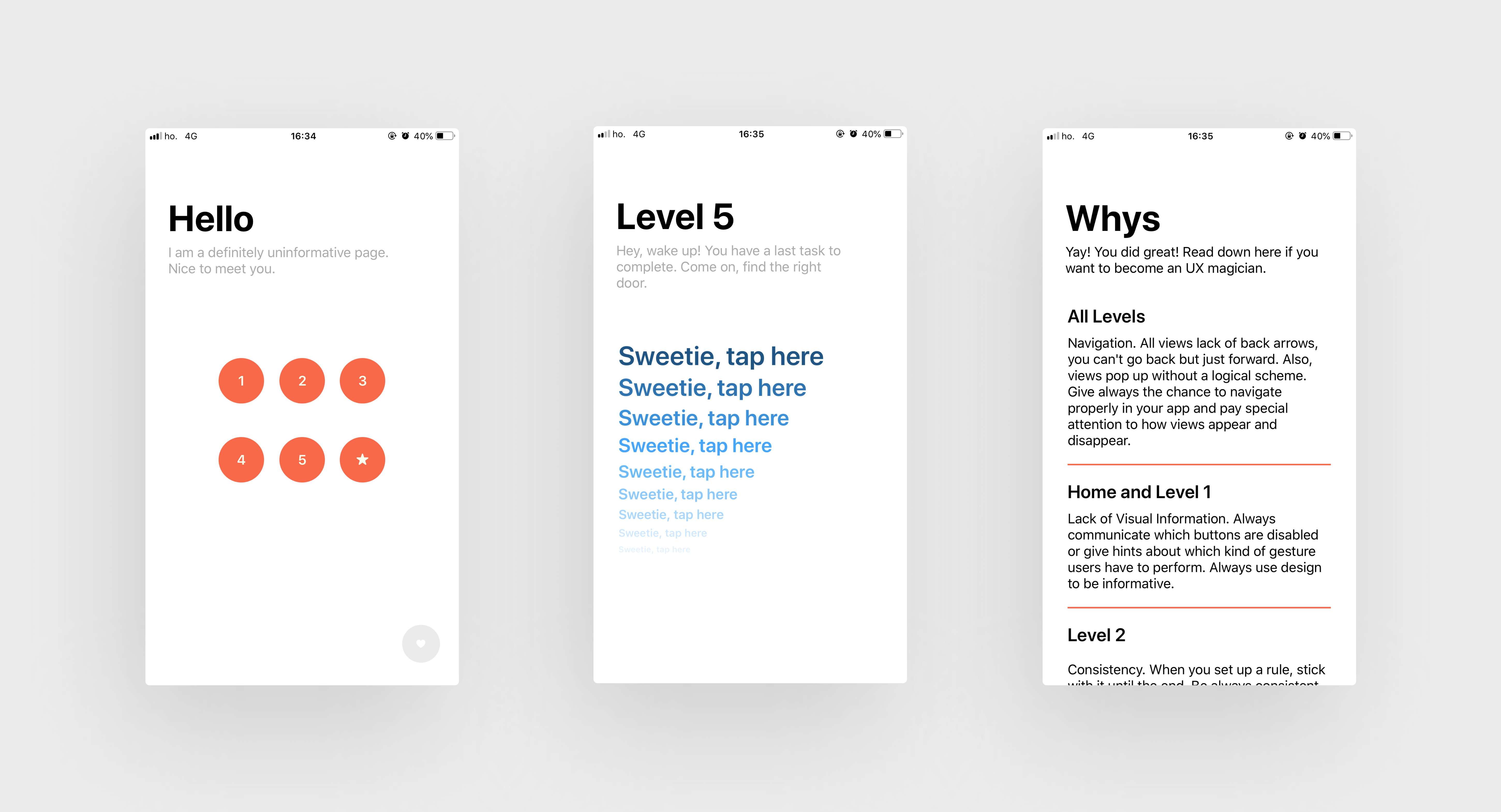
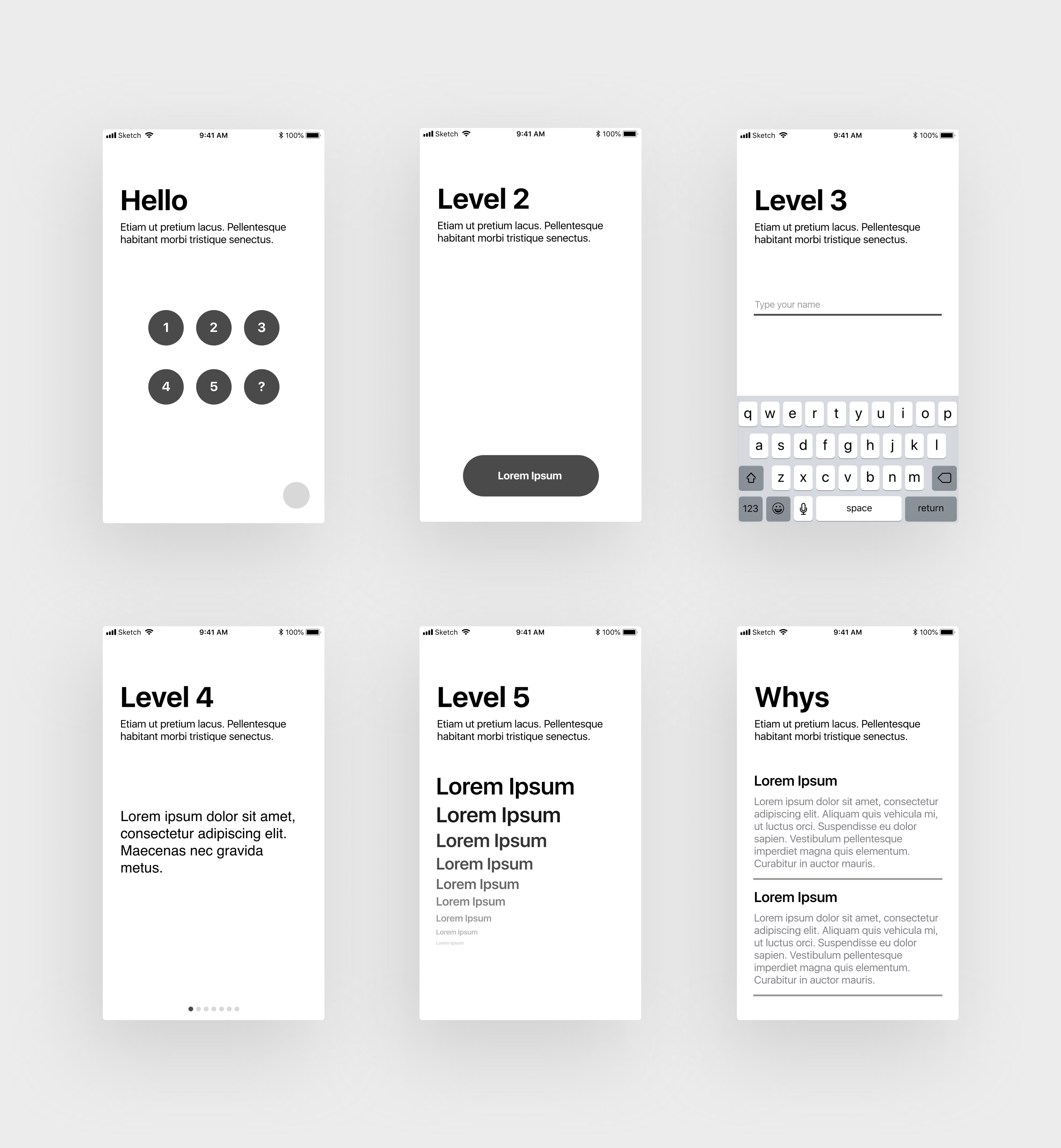
Since I had 5 different categories, I decided to divide my app in levels, each one dedicated to a topic, just like a game. The user is a solder who got lost in the process and need to overtake all the levels to be rescued
Let's Build the App
The 2nd day was fully dedicated to sketching some ideas with paper and pencil and when I was pretty sure about the solution I was thinking about, I started digitalizing and put some details. My first concern at this stage of the process was keeping things simple: I needed 5 ideas, simple but still informative.

In fact, I had to balance my limited knowledge of coding with my creativity: I was alone on this project and I was in charge of everything, coding included. I had just 3 days left out of 5, and I knew to desperately need all the days left to develop my idea since I was not a proficient coder. Luckily, at the end of the day I had my 5 levels crystal clear in my mind and digitalized on my Mac. So, I was ready and really excited to begin the development phase
After 3 days full of coding, crashes and “why this doesn’t work?!” I managed to build the entire app by my own and to publish it on TestFlight
─ USER TESTS AND OUTCOMES
Here it comes the interesting part of the whole project: user tests! Since each level of the app rapresents a common UX issue, it was really interesting see how people interact differently with the app. The issues built in the app were:
- Lack of information
- Lack of consistency
- Lack of behavioral interactions
- Lack of visual hierarchy
- Lack of escape process
Generally speaking, we can say that all the people who used the app felt quite disoriented and frustrated: if the app was a real service, we can say that they would have quitted it in the first 3 levels, for sure. The lack of information, the impossibility to go back or exit the processes, the lack of consistency and visual hierarchy have meant, for users, performing gestures completely at random, hoping to guess what need to be done to continue. Although all levels have been interesting to test, there are 2 of them that I want to analyze more in detail: Level 3 and Level 5
Important Notice: if you want to test personally the app avoiding spoilers, don't read further! Go directly at the end of the page, you'll find the link to test the app from your iphone
Level 3: Lack of Behavioral Interactions
When users arrive at this level, they are asked to type their name. Simple, isn't it? The trick is that the only way to hide the keyboard once it is up, is to press enter. If you try to tap outside, an alert appears telling you that the developer has not implemented this functionality. Let's think about it for a minute: how many times, maybe automatically, we close the keyboard by simply tapping outside on any portion of the screen? A lot of times. Of course, it depends how much the person is an active user of smartphones, chats and social networks.
In fact, I noticed that people who didn't get stucked on this level, were low-mid users of mobile technology, social networks and apps in general. For this reason, I think that there is a link between this behaviors and the keyboard dismisal: all people who were active users of smartphones, apps, chats and social networks got stucked on this for a while. I think that this could be explained thanks to the speed they have: they use smartphones a lot and for a various number of activities: chats, researches, social networks, etc. So they have a noticeable speed of use, originated from their need to optimize time and habits and are more likely to use "shortcuts".
Moreover, there is another interesting behavior common to all the users: when the alert appeared for the first time, users unconsciously thought that there was something wrong with the name they typed. So, their first reaction, was to change their nickname. This could be easily explained with the common tendency to not read alerts or error messages (at least, not the first time they pops up): the alert itself in fact, is perceived by users as "something you did is wrong" so they immediatly thought about the most common mistake they could have done (the nickname, in this case). This is not casual at all: how many times, when we are signing up for something, we changed our nickname because someone else already took it? So, in this case, their experience automatically activated their instict: they closed the popup without reading and changed nickname. Just after 3-4 times (but we'll see from the video also people who took a lot more) they finally read the popup and performed the right action.
Level 5: Lack of Visual Hierarchy
Another interesting level to analyze is this one. When users arrive here, they face 9 buttons: "sweetie, tap here". Each button has a different color, dimension and visisibility: users have to find the one which works and let them pass to the next level. As could have been predictable, the majority of people tapped the first button which is the bigger and the more visible: after all, the visual hierarchy is not a joke, isn't it?
But, the interesting behavior is this: when people faced this challenge, they start tapping buttons in series, from the first to the 3rd or 4th. At that point, they noticed that none of those buttons actually worked, and they suddenly interrupt this sequence and got confused. After this, most of the people went straight to the end of the sequence and tapped the last button (which actually is the only that works). This is not such a surprise since our brain works sequentially: when we notice that following a sequence doesn't work, we are most likely to go at the end of that sequence. Almost all people who tested the app had the same behaviour on this level, it would be interesting changing the position of the working button: what if I put this as second or third to last button? What people will do? I am planning to test this in the second release of this app!
─ CONCLUSIONS AND FUTURE PLANS
I am very happy and proud of the final outcome of this project. I had really a lot of fun testing how different people approached and used the app. Since the good results, I am working to add more levels and to modify some of the already existent. Even if with a limited numbers of examples, this project demonstrates how the user-centered design principles and a good UX can make the difference for the success of a product
Important Notice: due to overload limits, I have upload just few seconds of the more illustrative tests conducted. If you have suggestions and feedback or if you are interested in watching full videos and tests feel free to drop me a line. I'll happy to talk with you about the nerdy insights 

Challenge Yourself. Download UXperiment
You just need a good sense of humor. Got it? Perfect! You're ready to go!